When I joined Nimbl at the end of July 2023, I had no idea what an annuity was. Honestly, the first day I started with FIDx, I had to ask ChatGPT to explain it to me like I was in middle school. It told me to imagine a magical piggy bank. That is when I knew I was stepping into something totally new.
Before that, a superstar recruiter from Nimbl had reached out about the opportunity. They pitched it as “your role to shape.” Having worked with recruiters before during my freelance period, I thought, sure, that is what everyone says. But they were right. This role has truly been mine to shape and grow into.
Instead of being intimidated, I was excited. This was the first time I would take the lead on a project of this size and in a completely new space. The Insurance Overlay (IO) project kicked off in August, and from day one it was clear we were not just designing another feature. We were shaping something groundbreaking in the annuity space.
Those early days were just me, the project lead, and FIDx’s leadership team, traveling each month to meet with the first carrier. The sessions were all-day deep dives. I will not lie, being in a room with CEOs and senior stakeholders was intimidating at first. But it was also electric.
By September, I was already showing prototypes. The starting point was heavy: busy wireframes, lots of fields, everything crammed onto the page. It was overwhelming. And it confirmed what we already suspected: annuities are bulky, and if we did not simplify this process, advisors would not use it.
So I leaned into my outsider perspective. If I, as someone brand new to annuities, could understand the flow and move through it with ease, then an advisor could too. That became my north star: make it feel simple, clear, and familiar.
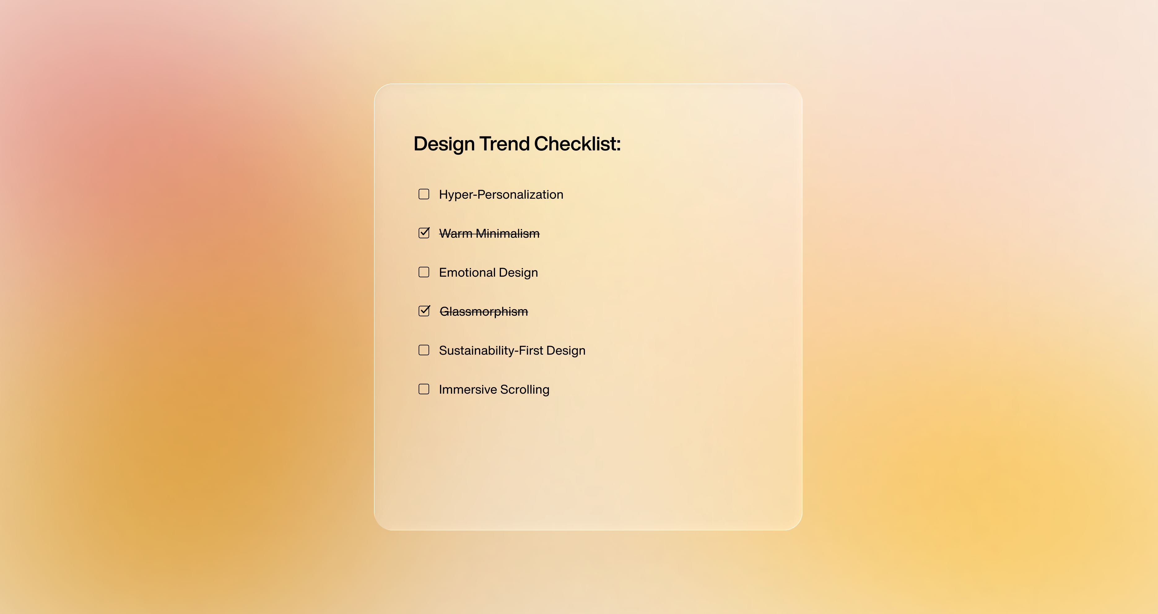
Annuities come with rules, exceptions, and compliance steps that can easily trip up an advisor. My approach was not to remove that complexity but to guide it. We pared back the heavy screens, removed distractions, and broke the workflow into smaller, digestible steps.
I borrowed from consumer platforms, not just B2B tools. Everyday digital experiences are easy to use because they blend familiarity with education. That is what I wanted IO to feel like, not another “system” but something advisors already knew how to use.
The result? A cleaner, lighter experience where every click feels intentional.
This was never just about individual screens. IO is a form-heavy platform, so every component matters. From the start, I expanded on FIDx’s existing design system to make sure it could carry the weight of IO.
That meant softening components visually, rounding edges, and designing with scalability in mind. We leaned on open-source frameworks like PrimeNG as inspiration for behaviors and interactions, but always refined them to meet the advisor use case.
Over time, those small design decisions added up to something powerful: a system that could deliver quickly, stay consistent, and scale to new implementations without reinventing the wheel.
Before Nimbl, I was doing more visual design, a mix of graphic and UX work. IO changed that. This was the first project where I was the lead designer, and that responsibility shaped me in ways I did not expect.
I learned how to hold my ground in rooms full of executives, advocating for the user when the pressure was on to deliver fast. I gained confidence presenting my ideas and standing behind my design decisions. And I started thinking more strategically, not just about what works now, but what will scale later.
By the time the platform went live to over 300 advisors in July 2025, I felt like I had grown alongside the product. And with the design team expanding from one to two, I am excited to keep pushing IO even further.
One of the most rewarding moments has been hearing how IO’s clean look and easy flow have become a favorite as FIDx demos the platform to new carriers, firms, and distributors.
Hearing that feedback directly in demo sessions or through the project lead and product owner is surreal. This was the first time I got to lead something like this, and to see my work resonate in real-world conversations is an incredible feeling.
If I had to sum it up, IO has taught me to:
Most of all, it has taught me to grow into my role as a designer who can lead. IO has been the foundation of my first two years at Nimbl, and it is only the beginning. The next implementations are already underway, with enhancements that are even sleeker and more streamlined.
Designing the Insurance Overlay has not just shaped a product it – has shaped me.